There are different ways to form and mold clay, but I used the coil method. By using this method, I was able to make my bowl as high or as wide as I wanted. To connect the coils to one another, I used the slip and scoring method where I roughed up the surface I wanted to connect clay to, then I used slip. Slip is basically wet clay that helps mend clay together. I learned by observing other people make their clay mugs, not to make the coils to thin because there will end up being a hole in the side of the mug. Thankfully, I never had the problem of my coils being too thin since I was making a turtle bowl that is a decent size. The biggest problem I had in making my turtle bowl, was that I did not make the base circle thick enough. Therefore, I had to wait until my clay had dried a little before I attached my legs to the bottom of the bowl.
|
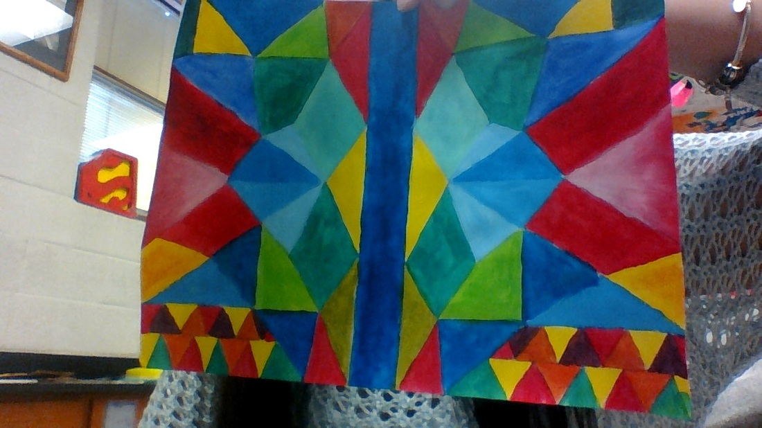
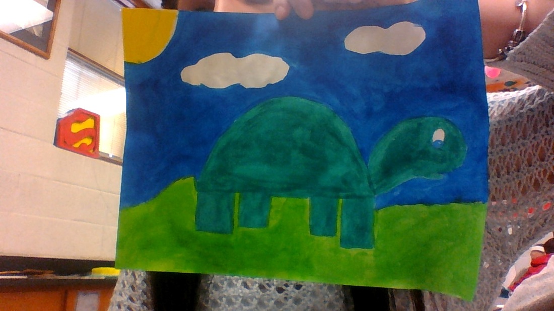
To create symmetry in my piece, I just drew a line in the middle of my paper and each time I drew a shape on one side I drew it on the other. I drew a turtle because I am obsessed with turtles!!! I used a random color scheme in my asymmetrical painting because I wanted to use as many colors as I could make with my 4 colors. In my symmetrical painting I used analogous color scheme because blue, yellow and green are next to each other on the color wheel. I was really happy with the way my paintings turned out, even though they took me a really long time to paint.
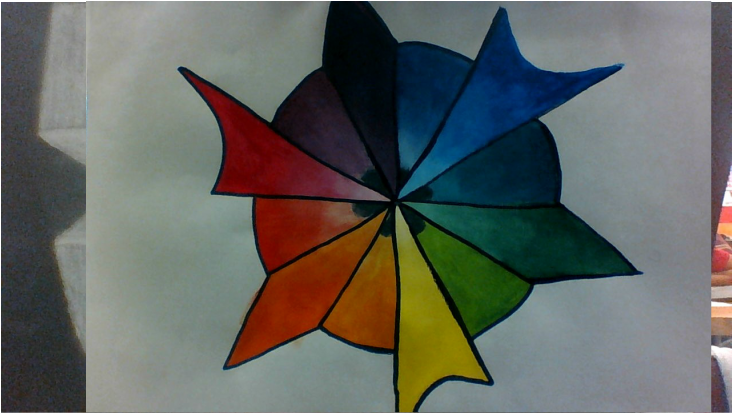 Primary colors are colors that can be combined with each other to make other useful colors. Secondary are they colors you get after you mix the primary colors together. Tertiary colors are colors you get when you mix a primary color and a secondary color together. I felt the hardest color to make was violet; my violet was never the color I thought it should have been. To create the different tints in my color wheel I used white to lighten up the colors. For my design, I tried to be as simple as I could but still be able to tell which design was for my primary, secondary and tertiary colors. I did a good job mixing my colors except for a couple, and it was easy for me to gradually get darker with my colors. To get better at painting, I need to get better at painting within the lines. I kept going out of the space for one color into another.
 I chose to draw the Eiffel Tower because I thought that it wasn't going to be very hard to draw. I struggles with drawing all the little lines because it was hard to take them to a vanishing point because some didn't even go to a vanishing point in the picture that I printed off. Even though it was hard to draw the little lines, I felt like I did a good job with that. If I would have had more time I would have went through and shaded in the areas that needed to be to give my drawing more detail.
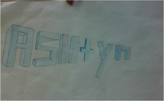
In one point perspective, there is only one vanishing point that lines extend to and in two point perspective there are two vanishing points. Also, the dimensions between the two perspectives are different. One point and two point perspective differs most on their positioning. One point perspective has one vanishing point, and two point perspective has two vanishing points on the horizon, usually one left and one right. The letters that were the easiest for me to draw were the A and H. It was hard for me to know which lines went to which vanishing point so the letters looked really weird afterward and I had to start over multiple times.
the point at which receding parallel lines viewed in perspective appear to converge is called the vanishing point. A horizontal line is measured or contained in a plane parallel to the horizon. In my city, I really struggled with drawing my streets and the park I had in the middle. I thought that the lines on the sides of my building turned out very well.
|
AuthorWrite something about yourself. No need to be fancy, just an overview. Archives
May 2015
Categories |
 RSS Feed
